LinkedIn Redesign
Design Innovation Illinois 2022
Role
UX Designer
Tools & Skills
UX Research, Figma, Usability Testing
Timeline
Sept - Dec 2022
Team
Priya, Kalyn, Sara, Zainab, Pub
LinkedIn is the world’s first and largest professional online network with 875 million users worldwide. With such a vast platform, it is difficult for users to find a catered space for their personal and professional needs.
Overview
With 75% of LinkedIn’s traffic coming from mobile devices, we reimagined the app’s overall user experience with a focus on helping users find more value in their networks and the content they are viewing.
There is a gap when replicating authentic, in-person relationships and conversations in an online space.
PROBLEM
SOLUTION
Reimagine LinkedIn to give professionals autonomy to learn and connect in a way that feels natural to them.
Preliminary Research. Initial Design Stages. Final Design Stages.
Our user interviews intended to gain a deeper understanding of users’ attitudes, beliefs, and experiences surrounding the LinkedIn app.
USER INTERVIEWS
We interviewed…
10
5
5
Recent Graduates
Students
Mid-Senior Level Employees
We focused on finding participants from all stages of their career as well as different industries and backgrounds. We had a larger number of college students, not only because they were more accessible on campus, but we also found they require more support and often use all intended purposes of the app.
“I don’t like how it says ‘this person liked this person’s post’.”
“As a college student, you get too stressed out about what other people are doing.”
“It looks like they took the website and tried to fit it into an app rather than design an app.”
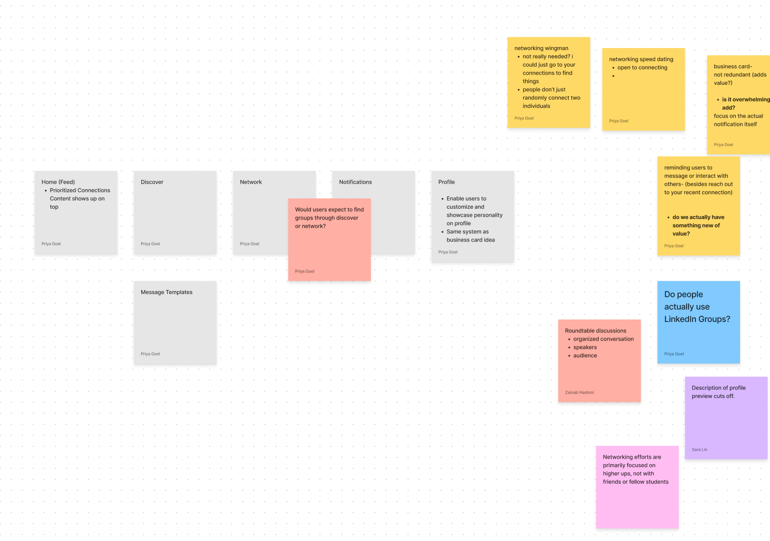
Many post-it notes later, we generated several insightful maps that helped us generate three focus areas:
Job Searching
Building meaningful connections
Posts/Content reorganization
SYNTHESIZING RESEARCH
However, after mapping out our insights and identifying trends, we decided to focus on connections and posts since they posed more opportunities for improvement.
COMPETITOR ANALYSIS
We took a look at what direct competitors were doing differently, what user goals they achieved to a higher standard, and focused on what we could and should leverage from these existing systems.
Because these social platforms drastically differ from LinkedIn, their strategies also vary accordingly. But all 3 organizations have one thing in common: to empower professionals.
USER PERSONAS
JOURNEY MAPS
Preliminary Research. Initial Design Stages. Final Design Stages.
INFORMATION ARCHITECTURE
To help us organize where functions should go, we used information architecture and mapped out where new features might exist as wells as where existing features can be rearranged or removed.
From the info arc, we changed the navigation accordingly. However, in the midst of our process, LinkedIn made similar updates to their interface as well, so we used their updated elements in our design.
SKETCHES
MID-FIDELITY WIREFRAMES
To reduce clutter, feed is divided into two sections: ‘My Network’ & ‘Network Activity.
‘Discover’ allows users to find new content, people, groups, events, etc.
Interactions accessed by pressing and holding on post.
Topic-based live conversations users can have with each other to increase engagement.
Prioritizing users to increase their content and activity visibility.
Notifications are sorted based on category and can be filtered, deleted, pinned, etc.
Customizable templates can remove stress user may feel when interacting with new people.
To assess if the features were actually beneficial to users, each of us conducted 2-3 initial user testing interviews on our mid-fidelity wireframes and utilized affinity mapping to categorize our insights.
INITIAL USER TESTING
“Interacting with post is not intuitive.”
“I like that the likes and comments are hidden at first sight.”
“What if there are too many tags?”
After user testing, we realized that many of the changes we made were UI-focused and dealt with the organization of LinkedIn’s interface. While this is important, we lacked substantial changes in creating more value within users’ networks.
Our questions were based around users’ attitudes and beliefs towards LinkedIn, but we were missing a key piece: their attitudes and beliefs towards building and fostering relationships.
Our initial research was structured in a way that was user-centric and not human-centric.
SECOND ROUND RESEARCH
We spent more time researching by going through articles, reaching out to people, and white-boarding to understand how users effectively network both in-person and online. We took these insights and translated them into revisions to our prototype.
…more affinity maps!
Preliminary Research. Initial Design Stages. Final Design Stages.
FEED
Feed Separation
By categorizing content into two sections, it ensures users are conveniently able to find the content they are looking for, helping them engage with their network more effectively. We also removed metrics so that users may shift their focus from how big their network is to how valuable it is.
Prioritizing Connections
To increase value and meaning to certain connections, users can prioritize them. This will ultimately help increase the prioritized connection’s visibility on different aspects of the platform such as the feed, notifications, network, etc.
DISCOVER
Discover Page
The Discover page features news, Convos, events and posts. It aims to provide users like Demi exposure to a wider range of content and people. The tagging system also allows them to explore topics broadly while still maintaining a personalized experience.
Convos
Convos allows users like Sahil to expand and deepen their network by engaging in live conversations with other users. Creators will have the ability to set a cap for talkers, but unlimited listeners can participate via chat. This way, all users still have the opportunity to engage with each other.
NETWORK
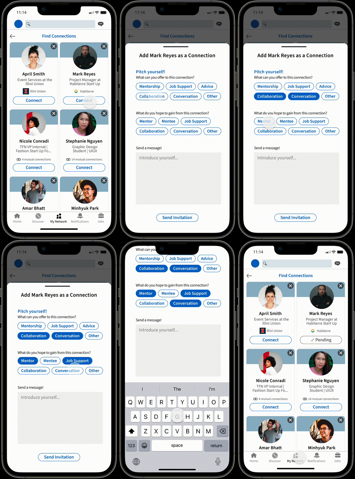
Adding Connections
To boost transparency between connections, this virtual ‘business card’ allows users to be more forward with what they want to give and receive from a connection.
Messaging Templates
Users who want to expand their network but may feel nervous to do so can create customized messaging templates to remove some of the stress of instigating that first contact.
NOTIFICATIONS
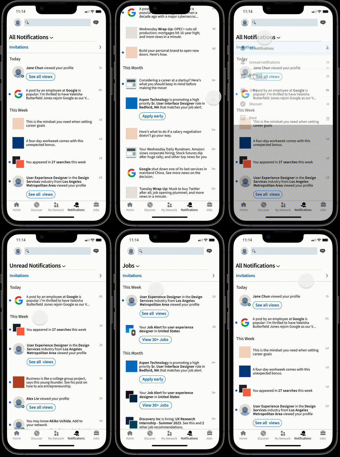
Notification Organization
A common pain point was how unorganized users’ notifications were. We’ve provided a solution where users can view their notifications by time and sort them by category such as unread, jobs, feed, and more.
FINAL USER TESTING
To finish off our redesign, we each conducted 2-3 final user testing interviews on our high-fidelity wireframes. We garnered many positive remarks as well as potential next steps and things to consider such as…
Cleaning up minor UI errors and clarifying design language
Having a feature that encourages users to take a break or stop scrolling
Creating more options for customization
…and to end it on a positive note, here are some things users said we did well in our redesign!
“Messaging templates are a really good feature for after meeting people at recruiting events.”
“I would 100% use Convos.”
“The business card idea is really needed. I think it’ll bring more meaning to each connection I make.”
Wow… this project was one of the most intensive (and rewarding) projects I have ever completed. I learned so much about the design process and really felt my design thinking skills were stretched to its farthest capacity.
Firstly, this was my first time conducting a redesign case study. I was initially unsure about the how the project would come to fruition because I couldn’t imagine LinkedIn any other way. However, the insights and ideas we gained throughout the process made me realize how powerful collaboration can be. Bouncing ideas off one another and spending hours discussing our research and designs were some of the most critical pieces to our success, and I am so grateful to have had been part of such a capable and creative team.
I also gained a lot of knowledge in how to have creative liberties while upholding a comprehensive design system. This project taught me how to be flexible and still maintaining immense attention to detail at a pixel-perfect level. LinkedIn’s design system is, by no means, easy to replicate, but I’d like to say our final design got pretty close to the real thing!
Lastly, I learned that designing in Figma is really only a small portion of the project and that research is everything. Even though going back and iterating through our research might have felt like we were taking a step back, we were actually preparing ourselves for a huge leap forward.
Overall, this project was crucial for my growth, and I enjoyed every step of the process. I’m looking forward to working with Design Innovation Illinois and continue cultivating my skills to become a more empathetic designer!
TAKEAWAYS


